How does my color garden grow?
One of the unheralded successes of Office 2010 is that it allows you to create art elements that routinely competitive with what is largely in vogue in the larger graphic design community. As much as people deride it at the expense of other packages (Keynote, et al), with a little bit of elbow grease you can turn out very effective unique effects.
For power users, this might not be the best practice (if you are adept at Illustrator, much of the time it doesn’t make sense to fight PowerPoint’s elaborate dialog box set up). But for the average practitioner, using some of the default design tools still can have a significant uplift on your presentation quality.
One of the keys to this is setting up an effective color palette. Customizing colors in PowerPoint, like many other details, can be time consuming (particularly in areas like charting), so having an intelligent palette is key.
How to set up an ‘intelligent’ palette? In a word: go dark. Previous versions of PowerPoint seriously constrained the number of available slots. Palettes automate color order for charting and effect some other default elements, but it’s this former condition, along with the styling options available for stock charts, tables, and elements (boxes, shapes, etc.) that make color choice key.
PowerPoint helps by offering a large number off stock palettes. They really aren’t bad, and give plenty of tonal range. Given how often people embrace ‘default’, simply selecting an option further down the list can differentiate your work pretty well.
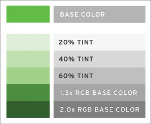
For those tasked with converting an external palette, or developing one new, note that the automated features have some embedded challenges. Starting with Office 2007, the default palette included tint backs (and what ever the appropriate opposite is: tint ups?), providing a range of tints of your ‘base palette.’
This is important because these values drive the automated formatting of shapes and charts. And the structure of the palette, which is largely based on a purely mathematical formula, is beholden to math, and therefore can result in some unfortunate color results. Any palette which starts with bright colors just gets brighter. Though bright colors aren’t inherently bad, the reliance on math means that any automated effects are hard to use, since the light end of the range runs to white quickly.
The diagram above shows the math applied by PowerPoint — tints of the first three levels are rigid. The darker tints are a more complex consideration having to do with RGB color ranges. If your base color gets too close to zero (black, in RGB values, is 0/0/0, and white is 255/255/255), the adjustments aren’t as stable in the darker values.
This will allow you to build and test palettes in other program before assign values in PowerPoint. In practice terms, if you have a well defined palette and are distributing it widely, it might be impractical to modify the location of some brand colors — given people’s propensity to skew to defaults, not putting them in the ‘top line’ is a challenge. But if you are dealing with a smaller group, or a savvy production team, you can tweak values so that you have a useable color range for the stock effects in PowerPoint while still allowing brand consistency.
The Impending Bandwidth Wars
One of the unheralded successes of Office 2010 is that it allows you to create art...

